


0. EP COVER 1. Dead Sound on the Radio 2. The Boy in a Tower
3. Snake Oil / Tin Foil 4. The Masquerade 5. On the Air 6. Sound Collages
Dead Sound on the Radio

“Dead Sound on the Radio” is my protest song against the use of generative AI of any kind in art and media. It’s actually the first song I wrote for the “On the Air” EP! I initially wrote the verse melody (and the first verse’s lyrics) in spring 2024, walking around in circles at a relatives house on a family vacation in Southern California. That night, I had read an article about how an indie game company had replaced a large chunk of their staff with AI (and in the preceding weeks, I had seen a few videos on Youtube about how, by the end of 2024, the whole of the human made internet would be eclipsed by the amount of AI generated content created at that point). Ultimately, it pissed me off so much that, like with most of my art, I had to make something out of it.
Dead Sound’s simple/repetitive melody and chords grew out of not having access to an instrument during the trip, so I improvised a number of hummed blues riffs to myself until I hit something I liked, and I made a recording of it for later. Musically, the idea for the song was to create the opening track for a live performance, to hit the ground running with high energy, and a simple, heavy guitar riff (with the idea for it to land in a similar way to Tom Waits’ “Lucinda / Ain’t Goin’ Down to the Well” Medley from his “Glitter and Doom” live album).
The bulk of the lyrics, the chorus, and the bridge were written when I got back from the trip. The structure of the lyrics was inspired by the lyrical structure of a song my uncle had introduced me to, “21st Century Schizoid Man” By King Crimson. So the verses each follow a short lyrical vignette, opening with a repeating refrain (“Dead sound on the [object]”), and followed by an instrumental chorus. Originally, the chorus for Dead Sound was supposed to be on a guitar, with an improvised guitar section in between each verse. However, when I played the song on my acoustic by myself, playing a riff on the guitar took the steam out of it. So I switched to humming—and later singing—a melody. I made a couple of different attempts to give the chorus words, or to write a more proper chorus for it, but they came across as kind of cheesy, so I scrapped them.
Dead Sound’s bridge actually came about from my own bias at the time against music that was too heavy. I had spent the last several years at that point listening almost exclusively to Jack Johnson, as well as lighter classic rock like the Eagles, James Taylor, and the Beatles. So I felt like it would come across as off-putting, or aggressive and heartless if I didn’t calm it down at some point. It was the heaviest song I had written at the time, so it felt almost scandalous! In hindsight, this was very silly, but I digress. In about 20 minutes I threw together 2 extra verses of words calling for the listener to ’Switch off the Radio’ among other household appliances (it initially included a line about unplugging a toaster) before I ran out of interesting or media related appliances. Then, I let those two verses sit for a couple of hours, before pairing them down to just the one repeated Bridge section.
As a final note on the song’s writing, it had a 6th verse in the original version (as opposed to the five in the final version), which can be heard in the footage of the song’s first live performance, shown here . It originally went “Dead Sound on the Radio / Dead Sound in your phone / listen to me now / or you’ll be stuck alone / Dead Sound on the Radio.” in hindsight, it didn’t work very well, but at the time I thought I might as well have the last verse repeat twice like the first two for the sake of symmetry. Also during this performance you can hear that I hadn’t figured out what I wanted the chorus melody to be yet, so I just kinda sang randomly into the mic. Thank you to the sound guy at Steel City who put reverb on my voice halfway through the performance! It really boosted my confidence!
Stages of Development / Recording
My brother Owen and I ultimately made two different versions of “Dead Sound on the Radio” before we decided it was done. The first version was a lot lighter than the final version in its instrumentation. We completed it in the late summer of 2024. It didn’t include any of the radio collages, and my vocals were a lot more laid back. Like I said, at the time I wasn’t a fan of anything heavier than Jack Johnson, so keeping the guitars somewhat light was my call at the time. Ultimately, I think the final version really serves the song a lot better than on the first version.
The second—and final—cut of the song was re-recorded a little under a year later (early summer 2025) after O’ had significantly improved in his production skills. We kept most of the lead guitar from the original, but re-recorded essentially everything else. For this version, O’ (rightfully) cranked the distortion, wrote a significantly better baseline, and added ambient effects throughout the song, which I think improved it quite a bit from the first version. I tried to be more manic in my vocal delivery as well, to make the overall tone more bleak.
Art Development
The art for “Dead Sound on the Radio” went through the most stages out of any of the “On the Air” EP art. I made the first version of its cover art in the summer of 2024, with the intention of it being an album/EP cover for a future project. However, I didn’t have a cohesive idea of what I wanted an EP to even sound like at that point, let alone what the art design was going to look like, so I was kind of wandering around blindfolded and bumping into anything that seemed interesting.
I created the first version shortly after finding out that my digital art software (Procreate) had a glitch brush/tool. I didn’t know how to use it very well, so I literally just filled a background layer with an off black, applied the glitch tool to the entire layer, and slapped my logo/signature on it. This version also predated my ‘one color per song art’ rule, which is why you can see a combination on blue red and green in the glitching here.
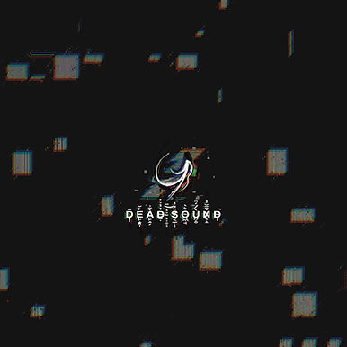
I then made a series of variations on it, and played around with one of those corrupted text font generators online, to try to give it more interest. I also tried inverting the colors to see if it made it any more interesting, including an empty back design, and an extended design, for if it was to go on a CD case or record sleeve.


After sitting on the design for several months, I ended up wanting to re-work it. I felt it was a little too bland, and lacked focus.
The second iteration of the single art came after I—spontaneously at 2:00am—decided it would be a good idea to create a sort of loose design bible for my music art. It felt like it made a lot of sense to try and give it all a consistent visual language, both across the songs for one project, and across multiple projects. That way it’d be more recognizable, and a lot more cohesive when looking at it as a set. So if, on the chance that some day I have a lot of these things, it’d be a little like looking at all the different JRR Tolkien books on a shelf all lined up next to each other, with the little JRRT logo holding it all together, so you can tell at a glance they’re all part of a set.
I settled on the final black background + white subject + one color per EP song (or in the future, one color per album) design after researching the visual art of Jack White’s various projects. They’re always very sleek looking, but with a lot of room for variation. However, I don’t like that he only uses one color per band. I feel like I, just personally, like a bit more variety than that, only because I know some of the things I write tend to differ pretty significantly from each other. So I’d like to keep my options open so everything has a bit more room to breathe. On top of that, I threw in the idea of using my informal signature for my art as a sort of logo (which, because I didn’t have a moldable, large version of because I had made the one on the previous cover art version exclusively for that design; I had to re-draw it from scratch…). I thought it’d be a fun idea to try and include, or hide the GYB logo (as I ended up calling it) in all of my music related art. That way there’s a definitive way to identify if something is mine.
This second version of the art was created around the same time as O’ and I re-recorded the song in 2025. There was a lot of news surrounding the Epstein files at the time, as well as a lot of weirdness surrounding big tech companies (specifically Twitter/X) censoring political speech they didn’t agree with on their platforms (particularly from left leaning groups) and so I wanted to try playing around with censor bars as a theme. Dead Sound also lent itself to the idea really well, seeing as the Switch off the Radio section can be interpreted as being silenced by the return to the third verse. So I added the Switch off the Radio text to the background of the art, and put censor bars over. I then played around with different layer effects (and more of the glitch brush) until I hit something I was happy with.

I also made a black version as an experiment.

I was actually so happy with this design that I was planning on using it as the final version of the single design until about a month and a half before I put “Dead Sound on the Radio” out as a single. The reason I ended up making another version was because this version read really poorly on the small square available for album/single art on Spotify, and other music streaming services.
Looking at the visual art of a few different music artists I like (particularly Hozier, Sleep Token, and Steven Wilson), It seems like big central figures or symbols read a lot better on streaming services than anything small, so I changed the idea up a bit. Seeing as this was my first single, visually I thought it would make sense to use it as a way to introduce any new listeners to the visual language of my music. So this time I put the GYB really big, and RIIIIIIIIIIIIIIIIIIIIIIIGHT in the middle, and I came up with this:

I thought it was a little bland, so I brought the censored text back in the background from the first version. This version ended up being the final version of the single art, as even though I personally didn’t think its as compelling as the previous censored text version, it reads a lot better when small, and still gets the point across.

Here’s a speed paint of the process. You’ll notice the art for “The Masquerade” pops up for a frame as I get close to deciding on the final version. both the final Masquerade single art, and the final Dead Sound single art were created around the same time, so I was trying to line up the GYB logo between the two.
Additionally, for a little while at the start, the text in the middle reads “The End is Quiet” instead of “Dead Sound.” “The End is Quiet” was a working title for the EP as it was in early development, so I was just playing around with it.
© Gavyn Bernhardt. All rights reserved.